Metal Messiah Symbols (part 2)

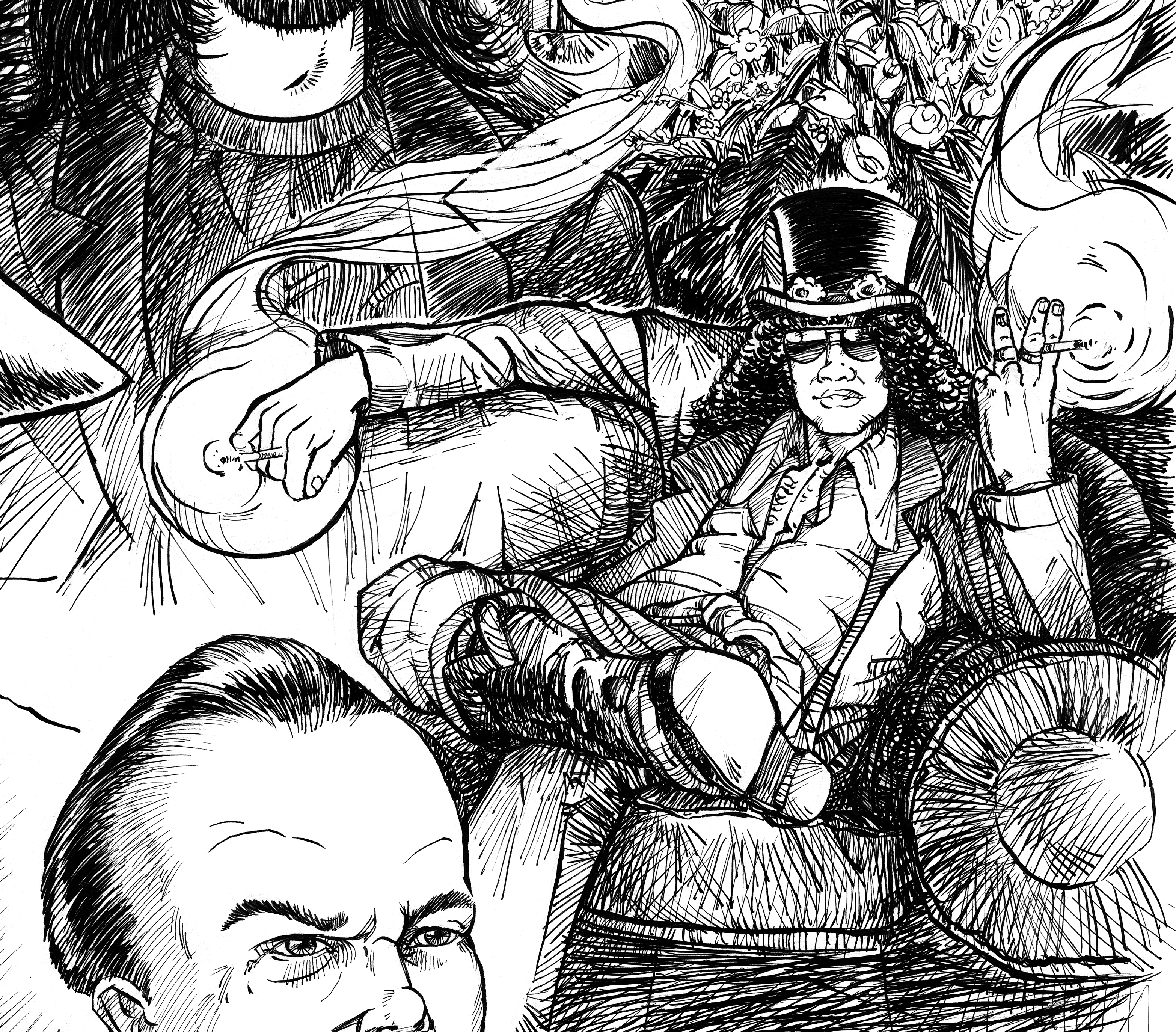
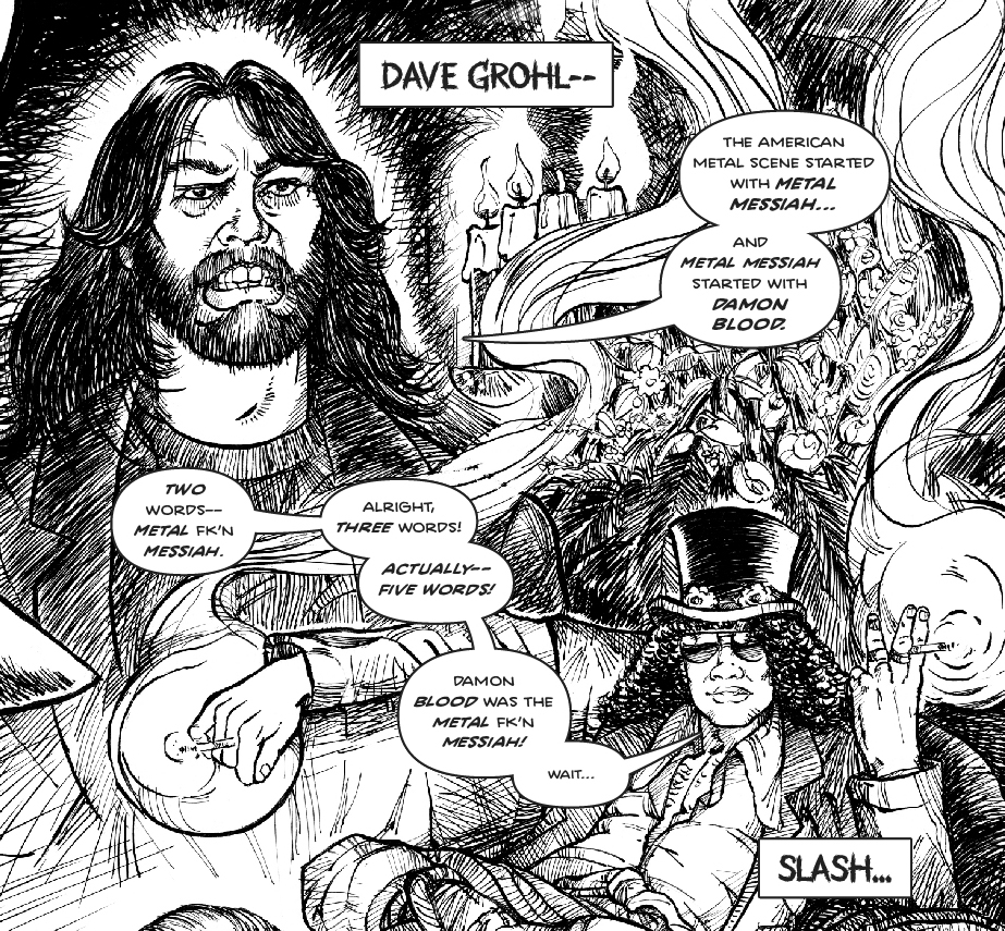
A little bit of a repeat post but more insight into the process: Now that the spoiler of Page 7 is out of the way I can keep talking about the symbolism on page 5. One was mentioned in a post last week – Slash smokes two cigarettes as a reference to “burning a candle at both ends” as a lot of rockstars (and even Johnny Punchclocks like myself) tend to do. Behind him is a (questionable?) likeness of Grohl, who although not widely known for his influence on metal (but it’s there! Google Probot/Dream Window) was well known for Nirvana’s effect on mainstream music before his bandmate’s untimely passing. Behind him are four candles, representing four members of Metal Messiah, one having been snuffed out.

Dave Grohl talks about Damon Blood as the most influential player in metal, four candles behind him, one is snuffed out. Slash has a problem with counting but he basically agrees.
(Metal Messiah: The Heavies of Metal page 5 detail)

Should I change it to three candles before going to print as a reference to Nirvana? Or leave it as is…?

Let me know if you find any of this stuff interesting! Give a like and a follow to Metal Messiah Graphic Novel if you have a minute. More to follow, next few pages will cover how the band Metal Messiah carried on after losing their lead singer/songwriter, Damon!

Page 05 revisited!

Time to revisit some old Metal Messiah posts and answer questions no one is asking! “Why is Slash smoking two cigarettes on page 5?”

Slash of Guns N Roses sits relaxed while smoking a cigarette in both hands.

It has to do with a little foreshadowing, but also is a reference to the dated expression “burning the candle at both ends,” in reference to how the rock-star lifestyle that has left some of them in rough shape (or worse) after years of partying and life on the road. I also have this faint early memory of G’n’R at an award acceptance, and although it’s probably my imagination it seemed like there was so much smoke! All of that together influenced the decision – not an accident!

My question for anyone who read this far… Is G’n’R even metal???

More to come.

-Sean

Anvilhead Ink Test

Confidence with inking is (slowly) improving! If folks can’t tell from looking at this, I’m going for a Toppi style to the textures and mid-tones. Not calling this a success, just a step in the right direction… Or at least a direction. Need to gain a little patience and self-control. Self crits are the obvious blotting and crosshatching direction changes are far too random.

Test inks for Anvilhead drawing, page 4 of graphic novel Metal Messiah.

To be honest, I have very rarely liked my own work in inks – but I’ve rarely done test runs before jumping into a project. Must slow down and get in the right frame of mind before starting… Maybe even warm up? If I’d practiced inking as much as I’ve sketched I’m sure I’d be better off by now!

-Captain Obvious

Ink Test

Dusted off the old inks yesterday afternoon. I won’t post the entire piece, but I’m only semi satisfied with this style. Still seems a bit too busy, unplanned:

Ink test for Metal Messiah - a cartoony face/skull screaming at the viewer with blue line work eliminated.

Not only testing out what skills I lost maintained, but also a technique I picked up somewhere of printing my own blue-lines. Saves a ton of time erasing since I can edit out out those non-photo blue lines easily in Photoshop, which also takes the pressure off seeing as I didn’t just destroy ruin ink over original pencils and can have another go without much effort:

Ink test for Metal Messiah - a cartoony face/skull screaming at the viewer with blue line work visible underneath.
Ah… progress?

Back to it – determined that his book will see light of day!

-Sean

Anvilhead sticker?

Here he is, the man, the myth, the narrator – Anvilhead (TM) himself. This is the original design intended to be turned into a small tabletop bust of one of the more colorful characters in the Metal Messiah graphic novel.

I wanted him to be larger than life, but essentially demon king of the heshers. He speaks in an on-again-off-again olde-english prose and has a penchant for hyperbole.

Anviilhead Vector Design

I wanted him to seem like the kind of guy who’s cool but gets a little TOO excited.

Did the linework using Adobe Illustrator, but the lines are a little too crisp for me. I don’t think this looks bad and might make it’s way into avatars / stickers / logos but the process helped me determine to do the rest of the book in traditional media!

-Sean