Anvilhead Ink Test

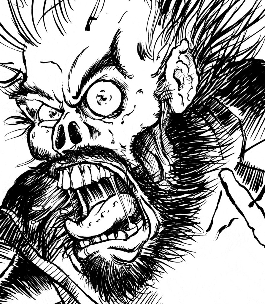
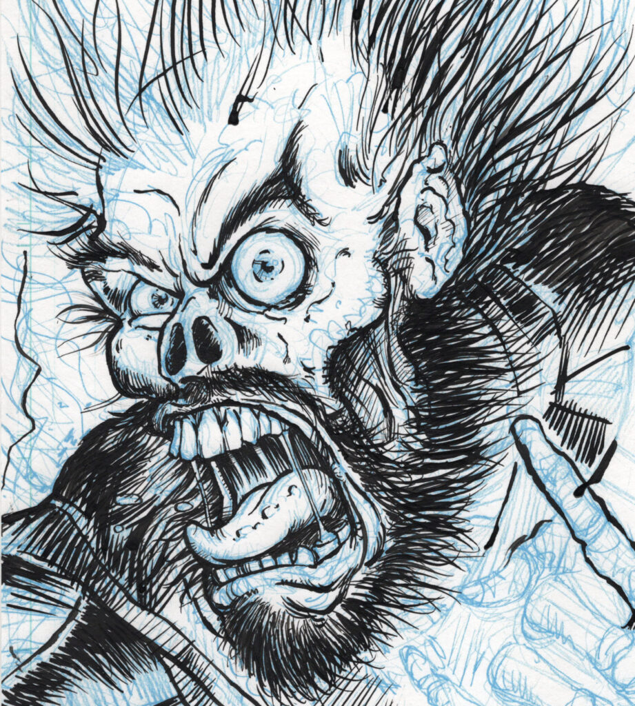
Confidence with inking is (slowly) improving! If folks can’t tell from looking at this, I’m going for a Toppi style to the textures and mid-tones. Not calling this a success, just a step in the right direction… Or at least a direction. Need to gain a little patience and self-control. Self crits are the obvious blotting and crosshatching direction changes are far too random.

Test inks for Anvilhead drawing, page 4 of graphic novel Metal Messiah.

To be honest, I have very rarely liked my own work in inks – but I’ve rarely done test runs before jumping into a project. Must slow down and get in the right frame of mind before starting… Maybe even warm up? If I’d practiced inking as much as I’ve sketched I’m sure I’d be better off by now!

-Captain Obvious

Ink Test

Dusted off the old inks yesterday afternoon. I won’t post the entire piece, but I’m only semi satisfied with this style. Still seems a bit too busy, unplanned:

Ink test for Metal Messiah - a cartoony face/skull screaming at the viewer with blue line work eliminated.

Not only testing out what skills I lost maintained, but also a technique I picked up somewhere of printing my own blue-lines. Saves a ton of time erasing since I can edit out out those non-photo blue lines easily in Photoshop, which also takes the pressure off seeing as I didn’t just destroy ruin ink over original pencils and can have another go without much effort:

Ink test for Metal Messiah - a cartoony face/skull screaming at the viewer with blue line work visible underneath.
Ah… progress?

Back to it – determined that his book will see light of day!

-Sean

Anvilhead sticker?

Here he is, the man, the myth, the narrator – Anvilhead (TM) himself. This is the original design intended to be turned into a small tabletop bust of one of the more colorful characters in the Metal Messiah graphic novel.

I wanted him to be larger than life, but essentially demon king of the heshers. He speaks in an on-again-off-again olde-english prose and has a penchant for hyperbole.

Anviilhead Vector Design

I wanted him to seem like the kind of guy who’s cool but gets a little TOO excited.

Did the linework using Adobe Illustrator, but the lines are a little too crisp for me. I don’t think this looks bad and might make it’s way into avatars / stickers / logos but the process helped me determine to do the rest of the book in traditional media!

-Sean